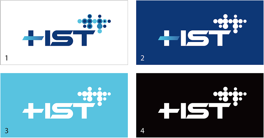
The HST logo centers on ‘Connection, Trust, and Addition,’ combining the letter H with a + shape to convey the message ‘Adding Trust.’ Strong straight lines and restrained curves provide stability, while the vivid blue tone emphasizes professionalism and reliability. The wordmark symbolizes the tech company's vision of expanding value by connecting customers and technology, and businesses and society, leveraging the expansive and positive meaning inherent in the plus sign.
Various circles come together to form the initials of HST. Designed to unify HST's diverse business domains into one cohesive entity, the overall form can be utilized as a pattern and motif suitable for various future applications. Each circle symbolizes a different industry sector and technological domain HST has entered, organically combining to form a unified corporate identity. The repetitive circular pattern signifies infinite scalability and a global network, while the regular yet dynamic arrangement represents the harmony between systematic growth and innovative thinking. Its modular design ensures consistency across various sizes and color variations, guaranteeing the brand identity's scalability and flexibility. This symbol effectively reflects the company's need to adapt to diverse cultures and environments within the global marketplace.